
Analytics
Dale McGeorge
Head of Product


Most agencies still build client reports by hand because of one bad memory. But the manual process has an error rate too — it just has no error log. The real distinction isn't manual versus automated. It's whether your failures are loud enough to catch before they leave the building.
Ask an agency owner why they still build client reports by hand and you will almost never hear “because it’s a good use of my time.” You’ll get a story instead.
The story is always the same shape. A report went out. A number was wrong. The client noticed first. Someone spent the next two days explaining a discrepancy that took eleven seconds to create, and the account survived, but the memory didn’t fade. Ever since, reports get built manually, checked manually, and sent by a human who has personally looked at every number.
That instinct is not stupid. It’s a rational response to a real event. But it has attached itself to the wrong target.
The fear isn’t really of automation. Nobody is nervous about a pivot table. The fear is of unattended automation — the gap between “the system sent it” and “I stand behind it.” What people are protecting is accountability, and they’ve concluded the only way to keep it is to keep their hands on every step.
This post is about why that conclusion is wrong, why the manual alternative is quietly worse, and what a reporting process you’d actually stake your reputation on looks like.
When people weigh up automated reporting, they compare it against an imaginary baseline: the careful, hand-built report, which is assumed to be correct.
That baseline does not exist.
Raymond Panko spent years collecting field audits of operational spreadsheets — real ones, in production, that businesses were making decisions with. Across thirteen studies conducted between 1995 and 2004, roughly 94% of the spreadsheets audited contained at least one error, with an average cell error rate around 5%. Not toy spreadsheets. Not first drafts. Working documents that people trusted.
The underlying reason is unremarkable and slightly depressing: humans make small mistakes in something like 2–5% of complex cognitive steps. A spreadsheet preserves every one of them perfectly, then propagates them through references and copied formulas.
The picture upstream is no better. In 2017, Tadhg Nagle, Thomas Redman and David Sammon published the results of 75 data-quality assessments in Harvard Business Review. On average, 47% of newly created data records contained at least one critical error. Using the loosest standard they could justify, only 3% of the quality scores came out acceptable.
What the audits actually find
The hand-built baseline was never clean
Four numbers from two bodies of research, neither of which was studying marketing agencies — which is rather the point.
None of this proves your reports are wrong. It proves something more uncomfortable: you have no idea whether they are.
A hand-built report isn’t a report with no errors. It’s a report with no error log. The manual process didn’t earn its reputation for accuracy — it inherited it, because nobody ever audits it.
Here is the distinction that matters more than manual-versus-automated, and it’s the one almost nobody makes explicitly.
A loud failure is a connector that drops. An expired OAuth token. A report that doesn’t send. Something visibly, obviously broken. It costs you an apology, a Slack message, and twenty minutes.
A silent failure is a report that sends perfectly. Every chart renders. The branding is right. The PDF is fourteen pages. And one of the numbers means something different than it meant last month, and nothing anywhere in the system noticed.
We’ve written before about how code fails loudly and analytics fails silently. A broken script throws a stack trace. A broken definition returns a number, confidently formatted, that happens to be wrong. The same asymmetry runs straight through reporting.
Two failure modes
The failure you fear is the one you’d actually catch
Same pipeline, same client, two very different safety nets.
A broken integration announces itself. A drifted definition returns HTTP 200, draws a chart, and waits for someone to notice months later.
Read that again, because it inverts the whole anxiety. The broken integration is the good outcome. It’s loud, immediate, cheap, and fixable before anyone outside your building sees it. The catastrophe you keep imagining is the one failure mode automation is genuinely good at surfacing.
What should keep you up at night is the report that has been quietly wrong since March.
Marketing data is unusually hospitable to silent failure, for four structural reasons.
Where it enters
Four injection points, one shared property
Each stage of the pipeline has its own way of changing your numbers without changing anything you can see.
None of these raise an error. Every one of them changes the number your client is looking at.
The platforms move underneath you, constantly and by design. The Google Ads API keeps a maximum of four major versions live at once and sunsets older ones on a rolling cycle — v19 launched in February 2025 and was sunset roughly twelve months later; v20 sunsets in June 2026. Every sunset is a forced migration for anything reading that API.
Some of those changes are breaking: the field disappears, the call fails, your pipeline stops. Loud. Annoying. Fine.
The dangerous ones are where the field survives but its meaning shifts — a new enum value, a changed default, a metric that now includes something it didn’t include before. Your query still runs. Your chart still draws.
GA4 will quietly withhold data from you. It applies thresholding when a row contains too few users to be safely anonymous, most commonly when demographics, Google Signals or high-cardinality custom dimensions are involved. It applies cardinality bucketing, rolling less common values into (other) once a dimension exceeds around 500 unique values per day. And the Data API can return sampled results on large or complex queries.
Google is not hiding this. The API response carries a samplingMetadatas field telling you exactly what proportion of events the report is based on, and the interface shows data-quality icons. The question is whether anything in your reporting stack reads them, or whether you’re pasting a number into a slide and calling it the number.
Nobody edits your report. Somebody edits the account. A conversion action gets renamed. A new one gets created and defaulted into “Conversions.” An attribution window changes. Consent Mode adjusts the share of modelled conversions. A channel grouping is edited retroactively, changing last year’s numbers.
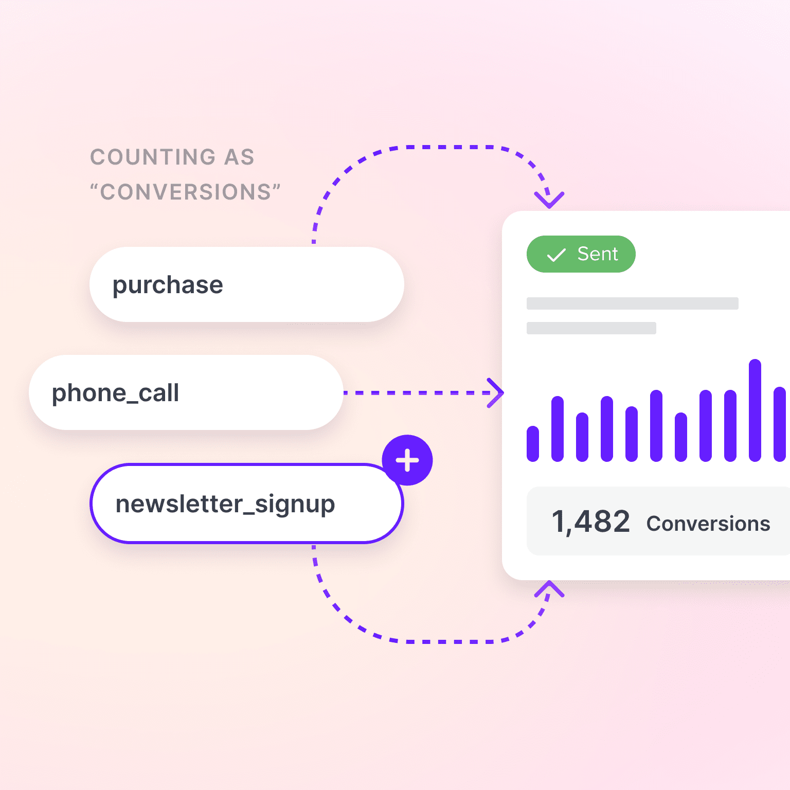
Your report faithfully continues to show a metric called “Conversions.” It just isn’t the same metric it was showing in January.
The unglamorous one that causes the most client-facing embarrassment. Platform timezone versus reporting timezone, so a month boundary lands in the wrong month. Currency converted at today’s rate instead of the transaction date. A client who changed fiscal calendars and forgot to mention it. Two sources that both say “spend” and mean different things — one gross, one net of platform fees.
Detection matrix
How each failure presents, and what actually catches it
The pattern is not subtle: everything cheap to detect is already loud, and everything expensive is already silent.
| Failure mode | What you see | What catches it | Type |
|---|---|---|---|
| Connector / auth failure | Report doesn’t arrive | Literally anything | Loud |
| Breaking API change | Job errors, pipeline halts | Error monitoring | Loud |
| Schema drift (semantic) | Nothing. Chart renders. | Version pinning + change surfacing | Silent |
| Sampling / thresholding | A plausible, smaller number | Reading response metadata | Silent |
| Definitional drift | A metric that slowly changes meaning | Governed definitions + anomaly detection | Silent |
| Unit / time drift | A number off by a consistent factor | Reconciliation against source | Silent |
| Human transcription error | Nothing. It looks typed correctly. | Removing the transcription step | Silent |
Note which column the manual process helps with. It removes none of the silent rows and adds the last one.
Three documented cases. Note what they have in common — and note that two of the three were manual processes, which is rather the point.
Testing labs uploaded positive COVID results as CSV files. Those files were imported into a master Excel workbook, which was then passed to contact tracers. The workbook was saved in the legacy .xls format, which has a hard ceiling of 65,536 rows. Because each test result produced several rows, each template held roughly 1,400 cases.
When a file filled up, the additional rows were silently dropped. No error. No warning. Over eight days, 15,841 positive cases were never passed to contact tracing, and tens of thousands of exposed contacts were never called.
The pipeline ran flawlessly the entire time. It simply stopped carrying all of the data.
“Growth in a Time of Debt” reported that average real growth turned slightly negative — around −0.1% — once a country’s debt passed 90% of GDP. That 90% threshold was cited repeatedly in austerity debates across multiple governments for three years.
A range selection in the spreadsheet had omitted five countries from the average. Corrected, the −0.1% decline became a +2.2% increase. The error was found by a graduate student attempting a replication — not by the authors, the journal, or any of the governments quoting it.
The Value at Risk model behind the “London Whale” trades ran in Excel with manual inputs. At one step it divided by the sum of two rates where it should have divided by their average, roughly halving the calculated volatility. The model returned a number. The number was correctly formatted. The eventual loss ran to roughly $6bn.
In every case the output looked exactly like a correct output. That is the entire definition of silent failure, and it has nothing to do with whether a human or a machine assembled it.
Manual reporting feels like a choice. It stops being one somewhere between client eight and client twenty.
AgencyAnalytics’ benchmarking put manual client reporting at roughly 5–10 hours per client per month before automation. Treat that as directional — it’s a vendor benchmark from a self-selected sample, and the incentive runs one way. But take the bottom of the range and the arithmetic still bites. Six hours per client, twenty-five clients, and you have 150 hours a month going into assembly.
Here’s the part that matters more than the hours, though. As client count rises, the time available per report compresses. And when a report gets compressed, the step that gets cut is never the building — you can’t send a report you haven’t built. The step that gets cut is checking.
Illustrative model · 6h per client · 160h capacity
Manual doesn’t scale into safety. It scales into haste.
Assembly time is non-negotiable — you cannot send a report you haven’t built. So verification is what absorbs the growth.
The agency that refuses to automate because it cares about accuracy ends up, at scale, producing the least verified reports in the market.
In 1997, Raja Parasuraman and Victor Riley published what remains the standard framing for this problem in Human Factors: “Humans and Automation: Use, Misuse, Disuse, Abuse.” They identified two symmetric failure modes, and most people only recognise one.
Misuse is over-trust. The operator stops monitoring because the system has always been fine. Parasuraman and Riley attribute it to automation bias and complacency. This is the failure everyone worries about — the report that goes out unread because the system has never let you down before.
Disuse is under-trust. The operator rejects or abandons an automated aid that is more reliable than manual operation, usually after seeing it make one visible error, or because they rate their own ability above the system’s. They go back to doing it by hand — worse than the machine, and now also tired.
Both are described as the same underlying problem: inappropriate reliance. Neither is the safe option. Refusing to automate isn’t the cautious choice; it’s the other failure mode, and it has a body of research behind it too.
The goal is not trust. It isn’t distrust either. It’s calibration — a system whose reliability you can actually observe, so your confidence tracks reality instead of vibes.
Calibration isn’t a feeling you cultivate. It’s a property you build into the pipeline. Five layers, in rough order of how much they matter.
“Conversions,” “spend,” “leads” — each defined once, applied everywhere. If the definition lives inside each individual report, you don’t have a definition; you have as many definitions as you have reports, drifting apart independently. This is the highest-leverage item on the list and the one most often skipped.
The system should refuse to send rather than send something built on a partial day, a stale connection, or a sampled response. This feels backwards — surely sending something beats sending nothing? No. A report that doesn’t arrive is a ten-minute problem you solve privately. A report that arrives wrong is a renewal problem you solve in front of the client.
Most anomaly detection watches client performance. Point some of it at the data itself. A metric that moves 40% overnight is either a genuine performance story worth leading with, or a definitional change worth catching before the client does. Either way you want to know on the 3rd, not the 30th.
This is the crux, and it’s where most “should we automate?” conversations go wrong. Verification only survives contact with a busy week if it takes four minutes rather than forty. A review step that requires rebuilding the report is not a review step; it’s the work again.
When the client asks why this month’s figure differs from the one in last month’s PDF, you need to answer in minutes, with evidence, not launch an investigation.
The same hour, spent two ways
Automation moves your judgment. It doesn’t remove it.
The argument isn’t that you spend less time on reports. It’s that the time you do spend goes into the part a client is actually paying for.
Automation doesn’t remove your judgment from the report. It moves it from the assembly line to the loading dock.
Division of labour
What to hand over, and what to keep
The split isn’t “machine does the boring bits.” It’s that everything on the left is mechanical and everything on the right is a judgment call your client is paying for.
If your review step requires rebuilding the report, it isn’t a review step. It’s the work again.
We build a marketing intelligence platform, so treat this section with appropriate suspicion. It’s here because the architecture above is the reason our reporting works the way it does, and that’s hard to explain without pointing at it.
Definitions live in the data model, not in the report. Unified fields mean “spend” is one concept across Google Ads, Meta, Microsoft and the rest, resolved once. Change it once and every report using it changes — which also means there’s one place to check rather than forty.
The draft arrives finished. The reporting agent builds the dashboard and writes the analysis using the client’s actual goals, industry, budgets and history rather than a generic template. That’s not a shortcut past the human — it’s what makes a four-minute review realistic instead of aspirational.
Master Reports keep structure consistent. One master cascades into every linked client report, with per-client customisation where it’s needed. It reads like a time-saver. It’s really a consistency control.
Anomaly detection runs continuously, so a metric that moves strangely surfaces before the report does, not after.
Delivery is yours — your domain, your branding, your sending address, as a live link or a PDF.
And the model you choose to write the narrative matters far less than the definitions underneath it. That’s an argument we’ve made at length elsewhere.
An honest list, because the overclaiming in this category is genuinely bad.
Return to the report that went out with the wrong number, because that story is the reason most agencies are still doing this by hand.
Look at what actually failed. Not a machine. A number was assembled without a check, sent without a verification step, and nobody found out until the client did. That’s a description of an unverified process — and the hand-built version is the least verified process available, because it has no definitions, no freshness checks, no anomaly surfacing, no audit trail, and a review step so expensive it gets skipped in any week with a pitch in it.
The choice was never careful humans versus reckless machines. It’s whether your failures are loud enough to catch before they leave the building.
Automate the assembly. Keep the judgment. Make the failures loud.
Thanks a lot for your feedback! If you’d like a member of our support team to respond to you, please send a message here
Oops! Something went wrong while submitting the form.


